Just Baby
Branding & Design
INTRODUCTION OF THE BRAND
Just Baby is a photography studio focusing on maternity, newborn babies and families. Their studio is located in Muar, Johor. “Artistic, warmth, happiness and touch” is what they want to create using their pictures.
OBSERVATION
Their target market is focusing on young parents whom may be social influenced. In the baby products, bright colors are often used and usually are colorful.
SOLUTION
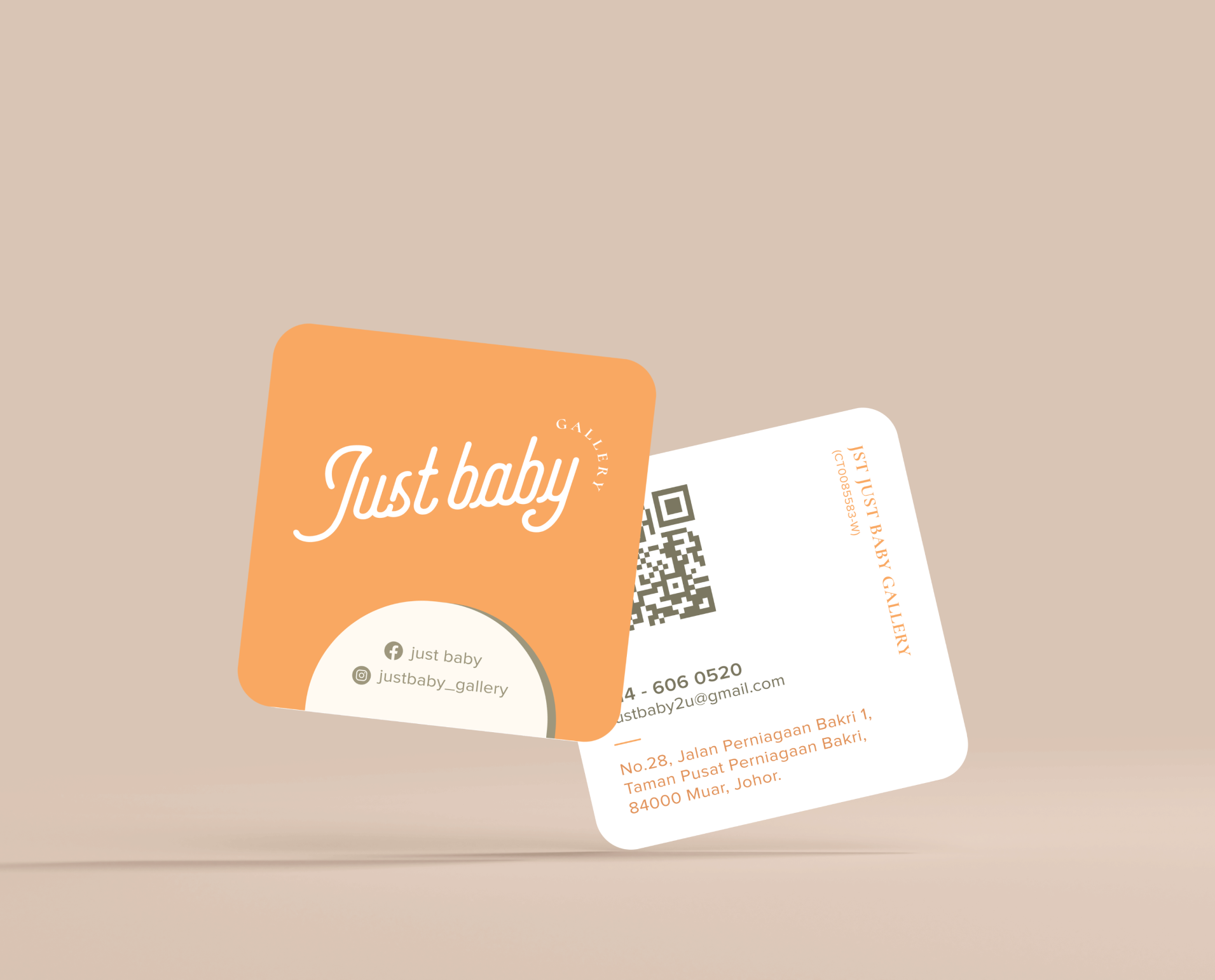
Wordmark is used as to show that Just Baby is a very straightforward brand, no pretence and real. The wordmark is composed from a handwriting font, to represents the warmth of the brand. The round-edge of the alphabets gives out a safe, secure and comfortable feeling. The curl of the alphabets leads to unlimited possibilities of the brand.
Marigold color as the primary color represents vibes and lively. As for the secondary colors, they are more to pastel colors to give warmth and softness to the brand.
Under the main reception interior design, we had incorporated circles on the walls which symbolizes completeness in the family. Also, the different hues of circle looks like bubble or balloons, to illustrate the dreamy atmosphere in the studio.
Services
- Branding
- Design
- Printing