Harmony Forever Organic Grocery
Branding and Design
INTRODUCTION OF THE BRAND
Harmony Forever Organic Grocery is a grocery store in Seri Kembangan, Kuala Lumpur. Their main product is selling various types of rice, groceries, fresh food/seafood, as well as specialty products from various towns in Malaysia.
OBSERVATION
Their target market are housewives living around the area. Housewifes usually will choose the best ingredients as they care about the health of their family members. Also, housewives of this era loves clean and dry environment for them to shop the everyday fresh food.
SOLUTION
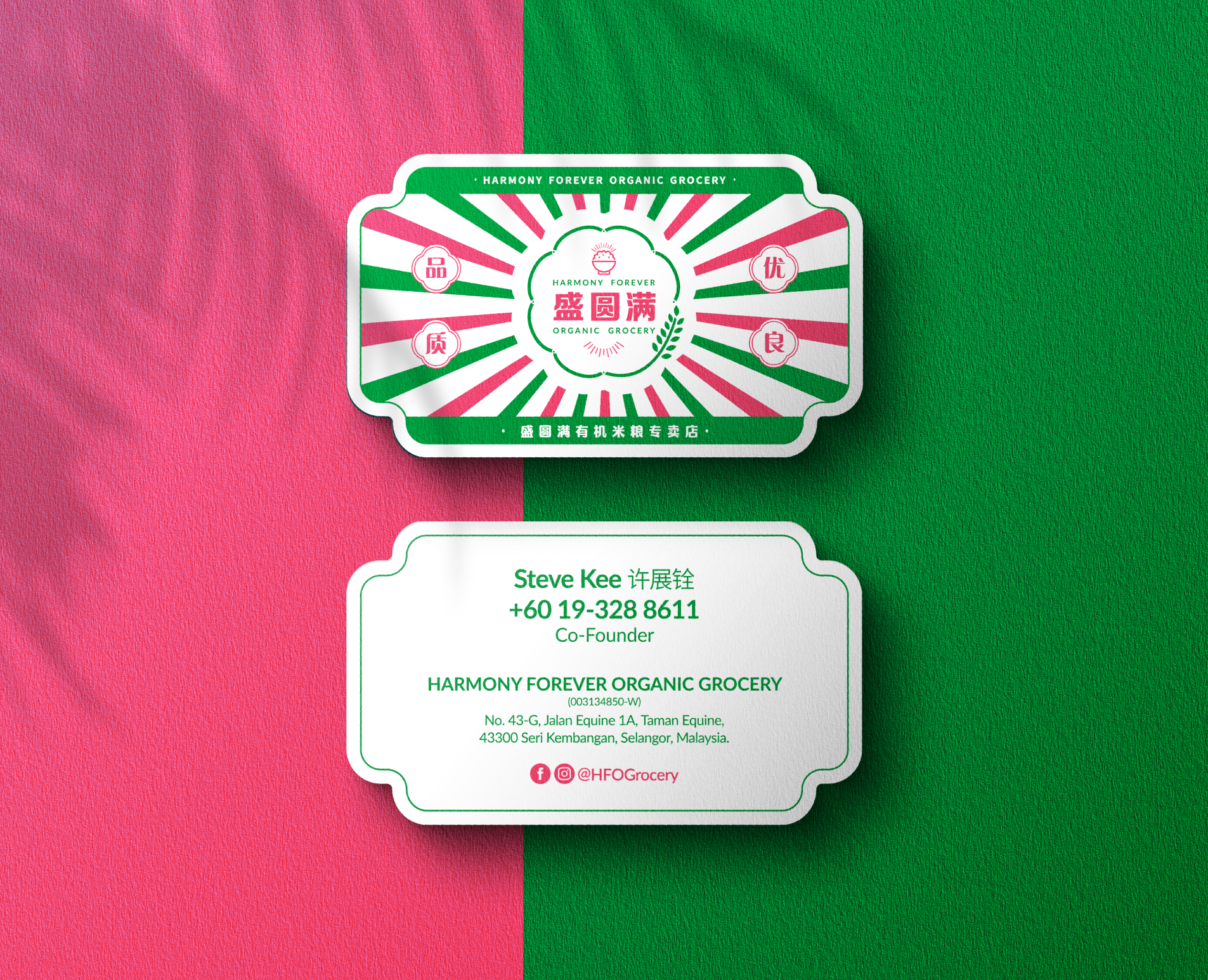
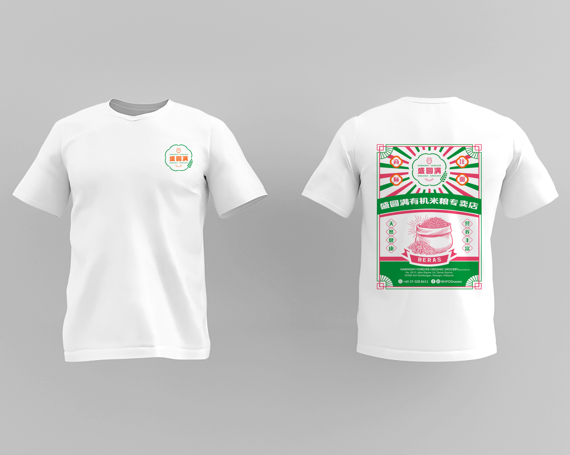
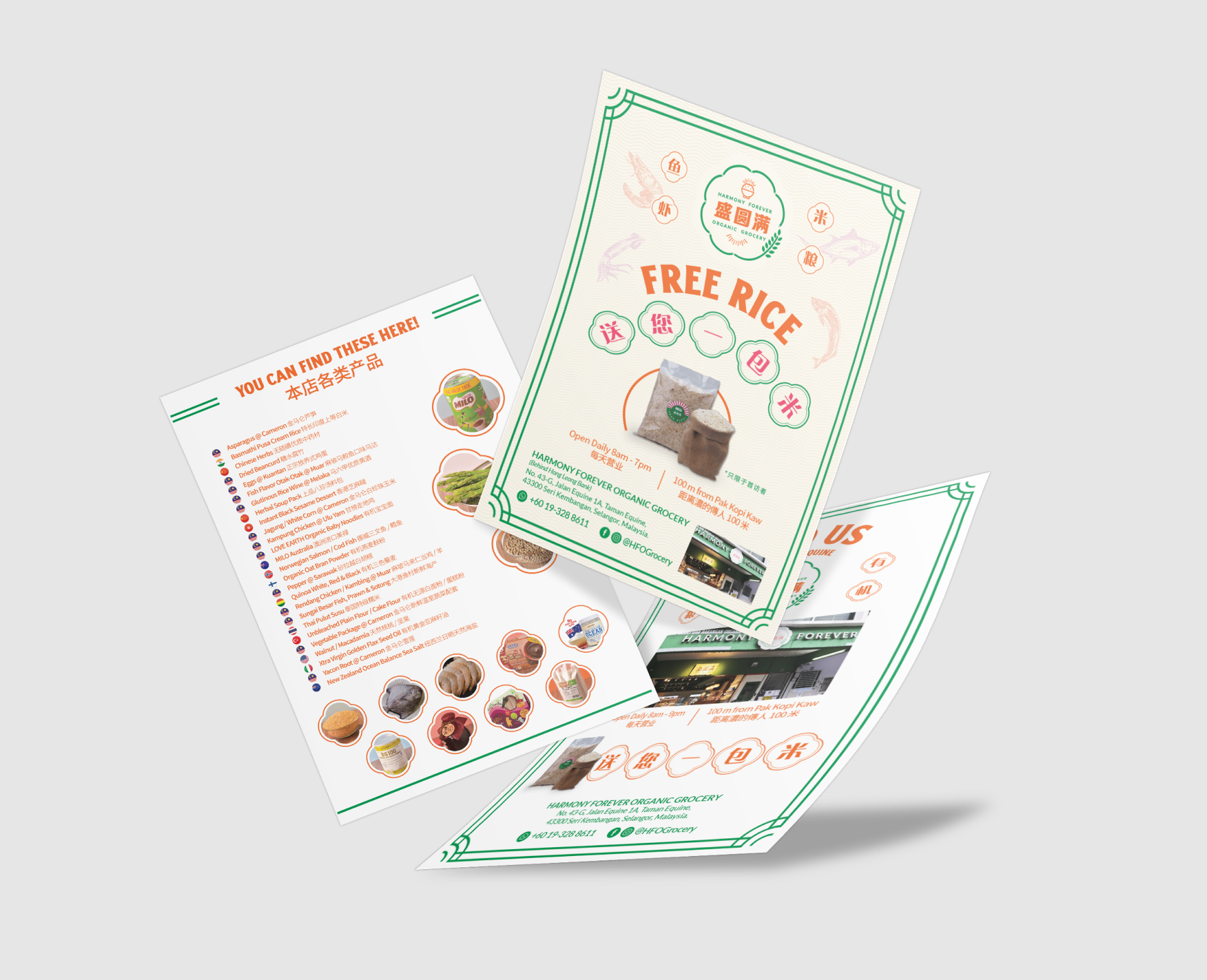
Green and orange were selected as the brand colors. This represents the shop always offers organic and fresh food to the customers. These 2 colors are eye catchy and makes the shop pops out among a row of shops.
The circle of the logo represents completeness and the bowl of rice in the centre of the logo indicates the core product, rice.
As for the interior design, real woods were used to give warmth and a touch of nature, which adds on the “organic” elements in the shops. It blends in perfectly with the brand color to make the shop looks inviting.
All the rice bags are placed on the floor, in order to ease customer to compare and choose the rice that they want.
As for the fresh food department, upon cleaning the seafood, all the fresh food are placed in the stand up fridge which makes fresh food shopping to be clean and mess free.
Services
- Branding
- Design
- Strategy
- Printing
- Social Media Management