NanaNest
Branding and Design
INTRODUCTION OF THE BRAND
NanaNest Bioessence is a brand that mainly focus on birdnest products. They are a birdnest supplier and had developed birdnest essence powder to be integrated in different types of health supplements or beverages. They are planning to go into international markets and China is their first market point.
CHALLENGE
1. There are a lot of competitors in China that offers similar product as NanaNest.
2. They are introducing 7 new products at the same time and the given project timeline is 2 months to ready all the brand identity and packaging designs
OBSERVATION
China market/consumers loves international products as they believe the quality of import products are way better than locally made products. The consumers that are willing to spend on birdnest are mostly mid-high income and are social influenced and luxury-oriented. Most of the birdnest brands will use swiftlets as their brand mark.
SOLUTION
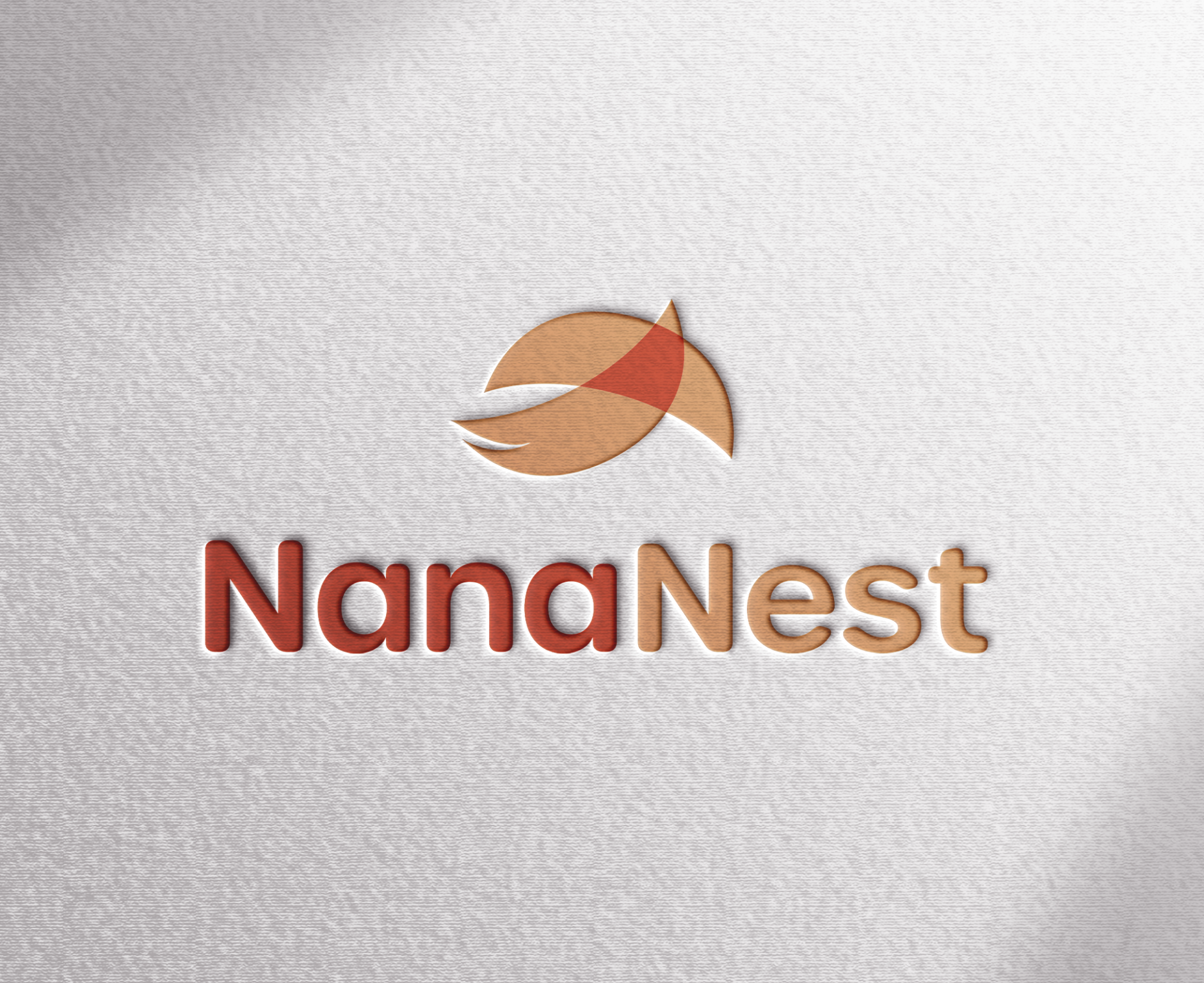
To show that NanaNest is a birdnest brand, we had integrated the birdnest cup into the logo mark. The mark resembles a swiftlet flying towards the sky, as well as 2 birdnest cups overlapping each other.
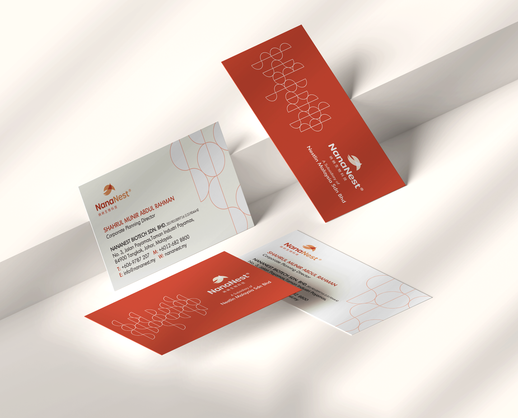
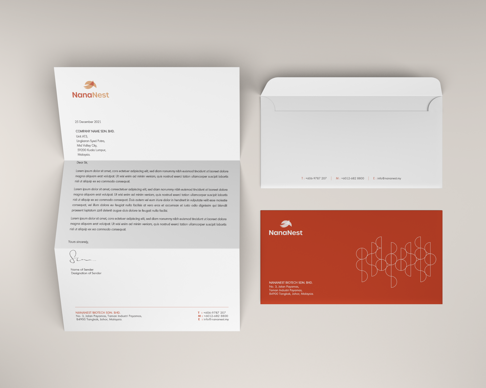
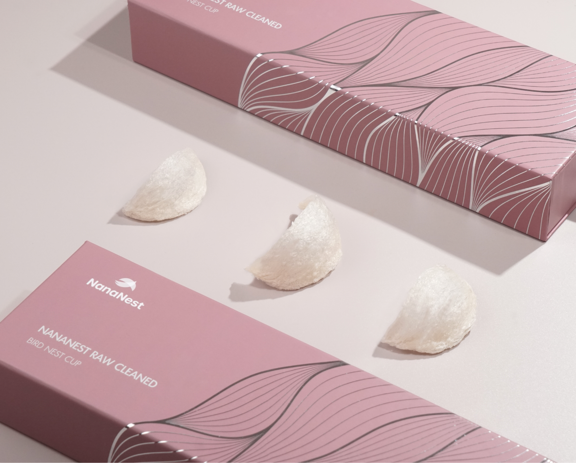
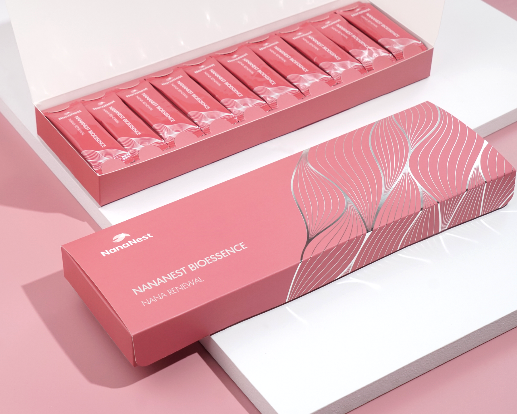
The graphic element of the brand is the pattern/ texture of the birdnest cup. It brings out the softness and movements into the brand, to resemble the gracefulness of NanaNest.
As for the color, the logo itself is orange which leads to the character of energetic, health and happiness.
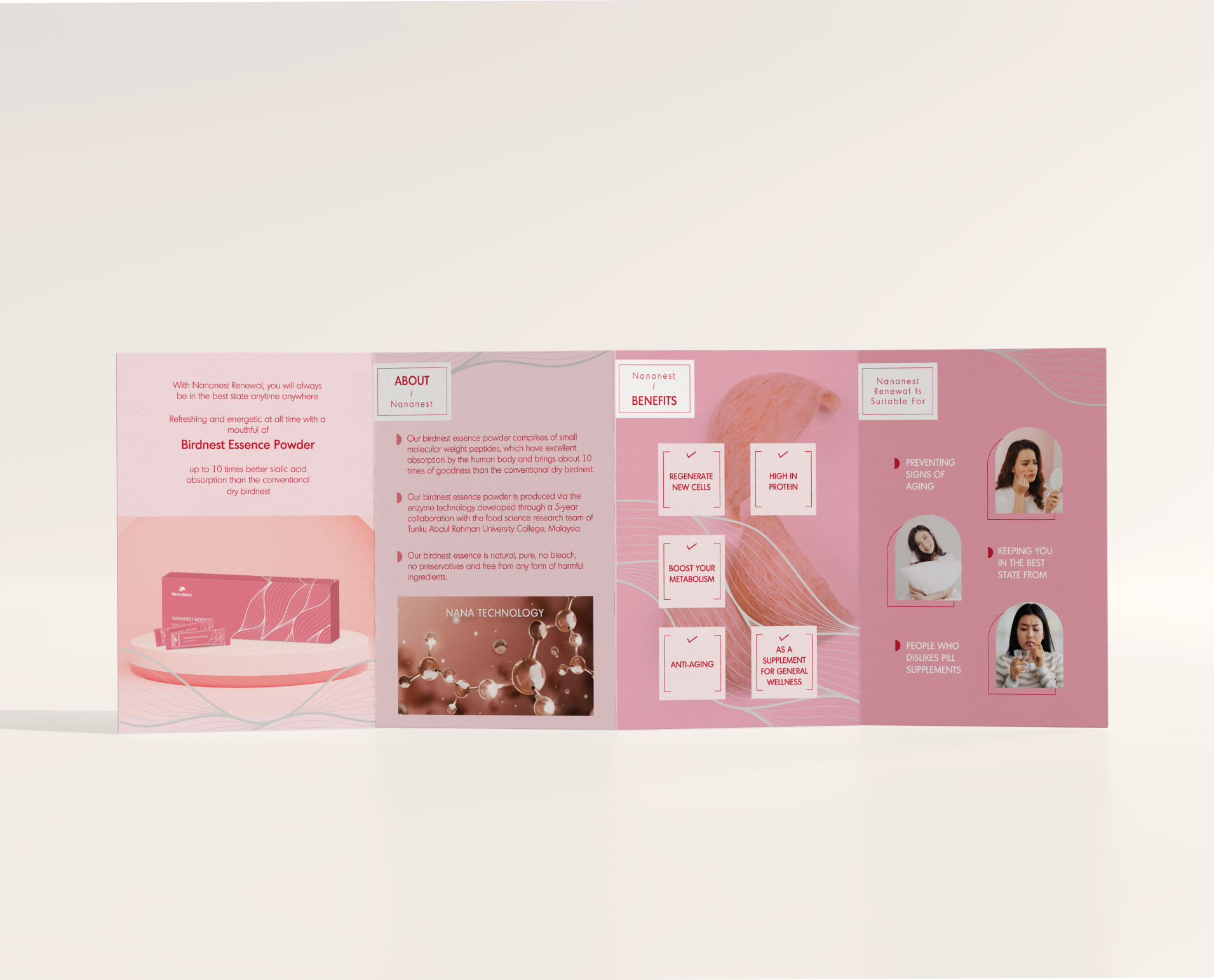
As for the packaging color, the tone is more to feminine color and all the 7 products are under a color scheme which blends together well. This may help them for easier packaging in future as a set of gifts/hampers that looks like a series of products.
Services
- Branding
- Strategy
- Photography
- Videography
- Printing